Down the Rabbit Hole: Part III - Secret of the Color Scheme
Jun 26, 2020
Part Three of Down the Rabbit Hole
Secret of Carol's Color Scheme in Mandala #5

Mandala #5 by Carol S. Ink and Watercolor
Project she posted in Color Wheel Mandala Part II on Skillshare
Several days ago I received a message from Vesta, another artist taking several of my Skillshare classes. Vesta wrote:
Hi Chris, I am still in Part 1 but jumped here just because I fall in love with one of your students' project. I was ready to ask you about it and was surprised to find the same student already had a conversation with you about the same project here as a discussion. My question is slightly different than hers-
I love Carol's color choice/harmony for both mandalas - 4 and 5 ( mandala 5 is the one I love so much, maybe because it was made from the heart on the back of the planned one :)
Carol is using Cool blue ( Manganese blue), Cool red ( Alizarin Crimson) and (am I mistaken??) neutralized hue as a choice for yellow (Nickel Quinacridone Yellow). I find myself to be very attracted to the combination of these colors as primaries but also to the secondaries and etc. What is the secret of that color theme? Does it remind me something on subconscious level or it is just because the Nickel Quin is a cool yellow, not Neutral?
A bit later, I received another message from Vesta.
I think we should ask Carol S for hep to refine the name of the yellow in her project. I went immediately online to buy the colors she listed but I couldn't find Nickel Quin Yellow. Instead I ordered Nickel Azo Yellow and several other Ochres hoping to be able to recreate her palette for these 2 mandalas.
Below are the two mandalas Vesta is referencing.
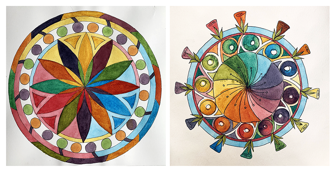
Mandala #4 and Mandala #5 by Carol S.
Here is what Carol had posted about Mandala #4 on her project page:
Mandala #4...The paper: Arches hot press 90lb (didn’t realize that I bought a lighter weight paper). I had to adjust as it wasn’t as forgiving as the cold press Arches I had used for the previous two. However, the pale colors really are delicious on hot press paper.
The colors I used: Nickel Quin Yellow, Manganese Blue hue, Alizarin Crimson. I switched out the cool yellow in the previous 3 colors from Aureolin to the warmer yellow to see what would change. I haven’t wrapped my head around that yet. I don’t usually pay attention to granulating colors but in this case I had two with the yellow and blue. It is part of the reason the stronger colors look, uh, well, granulated!
The next day she posted mandala #5 and wrote the following:
Mandala 5: This is the same colors as the one above. I had so much paint left over it was easy to just keep enjoying working with them and improving on the thickness of the paint. I was actually doing a quick sketch of my idea and kept going along and when I got my new fountain pens I jumped in and inked it, then completed painting. It is on the back of a painting exercise I did. Interesting how it moved along when I wasn’t feeling so precious about it. It’s on the Bee paper I don’t like much.
Both Carol and Vesta are the kind of students a teacher dreams of having in a class. They are curious. They have a strong desire to learn and to understand. The experiment even when nervous about the outcome. THEY ASK GREAT QUESTIONS! Their questions indicate that they are piecing information together in their own way and applying what they understand to their work to either confirm their understanding or to discover why what they have done either works ... or doesn't. These two have been keeping me on my toes ever since they signed up for my classes. I am so proud of both of them. Yes, they've cost me a few sleepless nights and I don't mind at all. I am 100 percent present for hungry, curious, hard-working artist. These two women definitely have all of those qualities.
A quick answer to a question that she pondered but didn't ask is why she was achieving granulation. The granulation is due to the manganese blue. Some pigments, especially the mineral blue pigments, granulate. Cerulean blue and manganese granulate noticeably all on their own without being mixed with other pigments and more noticeably when mixed with other pigments. Ultramarine blue doesn't granulate in quite the same way, but it does separate beautifully from alizarin crimson to create a marvelous effect when playing with the saran wrap technique. Nickel Azo Yellow is considered to be a non-granulating pigment. Mine doesn't granulate. Nickel Azo is similar to the Nickel Quinacridone. I totally believe Carol when she says that her Nickel Quin granulated. Not having that exact pigment, I can't verify that one way or another
What I want to focus on in this post is not the granulation, it is on the multiple questions that erupt like a volcano concerning the yellow Carol used in her palette, the Nickel Quinacridone Yellow.
Here is a bit of info I found online regarding Quinacridone Gold. This explains why it was so difficult to find consistency in the pigments between manufacturers.
GOLDEN was the first to introduce a Quinacridone Gold to the market and it quickly became a signature color for us. ... Only long time GOLDEN users would remember this single pigment color, since it was discontinued back in 1997 when again, the pigment became unavailable.
On Jane Blundell' blog I found this:
I recently found an old pan of Winsor and Newton genuine Quinacridone Gold watercolour. PO49. (I had already stocked up on old supplies of the W&N acrylic version :-) Needless to say I snatched it up as I was curious to see how their version compared with the Daniel Smith colour I know and love. Daniel Smith bought up the last supplies of this pigment many years ago and are the only ones still making the genuine version. On the screen they look very alike, though in real life the DS is a little warmer. It is interesting to note that a number of the DS colours that used to have PO49 are now using PO48 or other pigments.
If you aren't familiar with Jane Blundell I recommend you become acquainted. Her blog is chock full of excellent illustrated information on color and pigments. janeblundellart.com
Jane has made her own version of Quinacridone Gold and it's fascinating to read how she came up with her recipe. You can read it here:
https://janeblundellart.blogspot.com/2014/09/a-question-of-hues.html
Back to Vesta's question:
Carol is using Cool blue ( Manganese blue), Cool red ( Alizarin Crimson) and (am I mistaken??) neutralized hue as a choice for yellow (Nickel Quinacridone Yellow). I find myself to be very attracted to the combination of these colors as primaries but also to the secondaries and etc. What is the secret of that color theme? Does it remind me something on subconscious level or it is just because the Nickel Quin is a cool yellow, not Neutral?
Only Vesta can answer her question about the color scheme reminding her of something on a subconscious level. Color and color combinations are an extremely personal experience.
It's her question regarding the temperature and the saturation of the yellow pigment that I feel needs to be answered ... if possible. Why do I say "if possible"? Because in attempting to find a pigment I could substitute for the Nickel Quin Yellow I found numerous suggestions online. The pigments suggested varied from cool yellows to warm yellows, saturated yellows to neutralized yellows. This is the dilemma faced when identifying colors by their names and manufacturers rather than by looking at the pigment and determining for yourself whether it is warm or cool, saturated or neutral. This is exactly the dilemma that kept me going in circles for decades when attempting to understand the specific characteristics of each named pigment, only to be thrown to the dogs when I found that the exact same pigment name by the exact same manufacturer having the exact same identification number can be drastically different. I can either get angry about that or look at the pigment that is squeezed out of the tube and know how it will behave because I can now determine where on the color wheel the pigment lies, regardless of its name, manufacturer and identification number.
To illustrate my point, I made test strips of raw sienna from two different tubes. Both tubes are labeled Cotman (student grade made by Winsor & Newton), Raw Sienna #552.

The pigment on the left uses PY42 (synthetic iron oxide) plus PR101(transparent red oxide). The pigment on the right is made up of only PY43 (natural iron oxide). Why in the world would Winsor & Newton give these two VERY different pigments the same id number of 552? If a teacher or another artist told me a great combination of pigments is Cotman 552 and phthalo blue to make a gorgeous green, and the pigment she used was the one on the left but I had the one on the right, I would never achieve that gorgeous green that I strived for. Instead, I would wash a great deal of paint down the sink.
Below are color swatches of Raw Sienna manufactured by several different companies. The top row shows the pure pigment in full strength and diluted. The bottom row shows the result of mixing each one of them with Manganese Blue (mixture) by American Journey.

What do you do when you see a color you absolutely love in another artist's painting and you want to be able to mix that color yourself? You do what Vesta did. You get in touch with the artist and ask what pigments she used. Don't forget to ask the name of the manufacturers of the pigments. This will at least narrow the margin of error and inconsistency.
The Colour Index of pigments was developed in 1924. Currently, artist's pigments are labeled with the Colour Index identification of each pigment that is used to create the color in the tube. This was not always the case. Most of my older tubes of paint, identify the color only by the name of the color and the manufacturer's specific number by which they keep their inventory data. These id numbers are different for every manufacturer.
I rarely pay attention to the colour index number on my paint tubes. I look at the color itself. I'm far happier. I no longer become frustrated with color mixing and I no longer wash enormous amounts down the sink. I am grateful that manufacturers now list the colour index numbers on the tubes so that comparisons can be made and alteration in recipes can be identified. Synthetic pigments can be controlled far more easily than natural pigments. Like everything in nature, it is always changing. Some pigments, like the Quinacridone Gold, are no longer available.
I made these strips because several artists recommended using either yellow ochre or raw sienna as a substitute for Nickel Quinacrodone Gold. After comparing the yellow in Carol's mandalas to the strips I made of Raw Siennas, Nickel Titanium Yellow and Nickel Azo Yellow, as well as multiple yellow ochre strips. I opted to use the Nickel Azo Yellow. That brings me back around again to Vesta's question. Yellow ochre and Raw Sienna are definitely neutralized yellows. Nickel Azo Yellow is not at all neutralized. I think of it as a cool yellow, though I did see online that a few artists think of it as a warm yellow. Where does the truth lie? I don't think it matters. What matters is being able to create the color you wish to create. In order to do that, you need to trust your own eyes.
I strongly urge my students to learn to rely on their own eyes rather than the names and numbers on the tubes.
*****
Thinking about taking an online art courses? I offer bite-sized classes on Skillshare as well as more comprehensive classes here on ExploreWithChrisCarter.com.
If you aren't already a premium member on Skillshare, please check it out. You receive a two month trial period totally free when you click on my link: Skillshare.com/chriscarterart
Most popular Skillshare classes are the Pulling the Puddle watercolor technique (Series of four classes), the Color Wheel Mandala classes. and Fun Flexagons.
I'm creating most of the classes on Skillshare as bite-size classes within a series. Each series, as I complete it will be bundled together with additional lessons added to it to create a more comprehensive course here on ExploreWithChrisCarter.com for artists who truly want to learn new skills and master their current skills.
Most popular classes on Explore are The Color Scheme Game and the Creating Dala and the Drawing Alternative I courses.
Thanks for reading my blog!
Subscribe
Join my mailing list to receive notification of new blog posts and update on the online courses.
Don't worry, your information will not be shared.
We hate SPAM. We will never sell your information, for any reason.
