Long Overdue
Jan 27, 2020
Five or six years ago a friend asked me to transform a painting she purchased at a furniture store in 1970. It no longer suited her. She wanted me to turn it into something that would coordinate with the area rug in her guest room. I'm not keen on painting over another artist's work. However, the art was headed for the dumpster. I agreed to meet the challenge. Still reluctant, I put off packing my oil paints in the car each time I headed to Maryland ... until last Friday. Along with oil paints, brushes, palette knives and turpentine, I slid an easel into the back seat. The 36" square canvas would have been difficult to work on without a substantial easel. I also packed my Strada easel and tripod to use as my palette/table.

Strada Easel (Standard Size - 15" x 11" x 1.5") with side trays and Sirui Tripod

Da Vinci folding easel
The painting by R. Styles was originally dark browns and golds in thick relief on a smooth, light-toned background. When I first saw the painting, Anita had already white-washed it with a bit of latex paint.

This is the state of the painting before I began transformation.

Sanding the surface so that the new layers of oil paint would adhere better to the layer of latex paint Anita had previously applied.

Dave vacuuming the loose particles that resulted from the sanding.

Sunflower Rug

Limited Palette
I packed a limited palette of Cadmium Lemon (cool yellow), Cadmium Yellow (warm yellow), Permanent Alizarin Crimson (cool red), Cadmium Scarlet (warm red), French Ultramarine Blue (warm blue), Winsor Blue - Green Shade (cool blue), Terre Rosa and Permalba white. I brought Terre Rosa as my convenience color, a color I can easily mix with my six primaries but I use to save money. Terre Rosa is less expensive to use than using my yellows and reds to mix a beautiful, neutral ... in this case brown.
First, I mixed up piles of paint, comparing the mixed pigment colors to the colors in the rug. Colors can be very deceiving, especially in natural light where there is dramatic sunlight and dulled shadows being cast on my canvas, palette and rug.
A note on lighting:
Recently, when I took a class at the St. Ives School of Painting with Alice Mumford, we painted from morning til evening with only the light that came through the not-so-large windows. It felt very peculiar at first. I had to keep reminding myself that I don't mind painting in the darkness of pubs and theaters. I can use the same approach of painting by value rather than color. The results in St. Ives were surprisingly wonderful. Everyone had excellent color in spite of the poor lighting on the canvases as well as the many still lives placed around the studio. I decided to experiment with this lack-of-lighting / inconsistent-and-spotty-lighting approach. (The lack of lighting was by choice. The school had recently installed amazing studio lighting. We turned it on only after we had cleaned up for the day.)

I began by scumbling on color with brushes, defining petals, redefining petals and adjusting shapes. Creating patterns that worked WITH the thick relief of the original painting was the biggest challenge.

I was glad I brought along one of the brushes I use to paint the trim in the house. It moved the initial stages along more quickly.

Halfway through the second day I switched to palette knives.

The palette knives served two purposes. They enabled me to apply very light value color (slightly tinted whites) without them immediately mixing with the not-yet-dry color beneath. They also allowed me to create texture on the canvas that would hopefully help to unify the sunflower pattern with the thick relief I was painting over.

I made sure not to obliterate the original artist's signature.

By late afternoon on the second day, the task was complete.
Dave and Anita are happy. I am also happy to have one less project on that list of projects I'm putting off until I have more time.

I doubt I will ever have more than twenty-four hours in a day or that I will awaken to a day when all of my projects are complete and I haven't started at least one new one on the previous day. Inspiration pours into my days from every direction. I am finally getting a bit better about prioritizing.
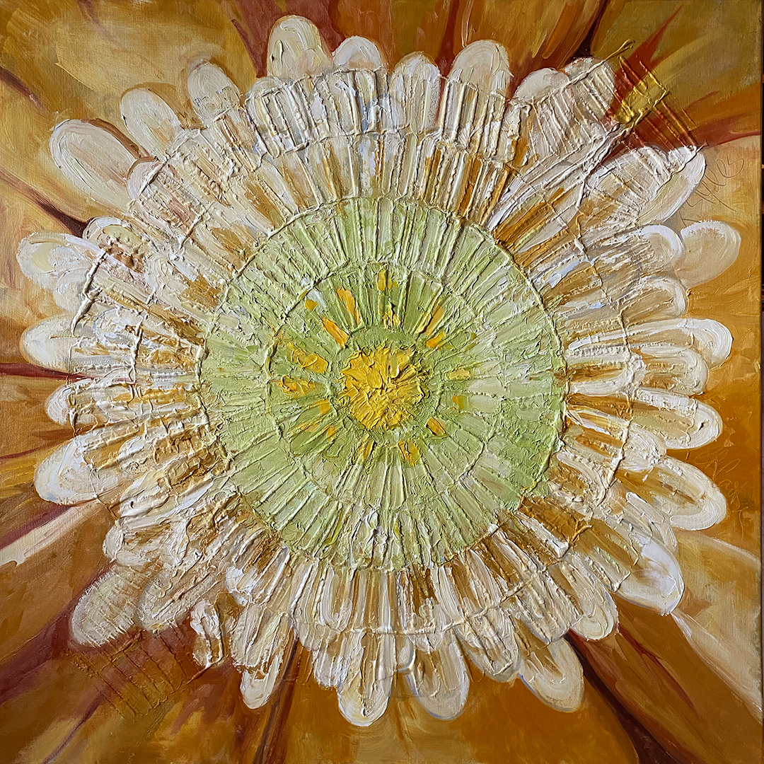
Now the painting has two signatures scratched into the paint. This was an unintended collaboration.
*****
Color mixing: Pigments are the same for all media. the difference is in the binder used to hold the pigments together. For watercolor, it's gum arabic. For oil painting, it's oil. For more info on mixing colors and achieving your desired results, take a look at my online courses that focus on color. You'll find all of the available online courses here: Online Art Courses
To view a selection of my art, please visit the various galleries at ChrisCarterArt.com
Subscribe
Join my mailing list to receive notification of new blog posts and update on the online courses.
Don't worry, your information will not be shared.
We hate SPAM. We will never sell your information, for any reason.
